In the book “Going Agile Project Management Practices”, I describe the use of a color-coded probability and impact matrix for classifying risks. (Figure 1) Visualizing the probability, impact, and severity of risks is a great tool for engaging project team members in risk management.
Figure 1 Example Risk Matrix as Excel Bubble Chart
The following are the instructions I used to create the risk matrix in excel.
Risk Register
The risk register should include at least four columns, such as (Table 1):
- Short risk name or ID: a short name for the risk that should be displayed in risk bubble and/or legend
- Probability: probability of the risk occurring e.g., scale from 1 to 5.
- Impact (or consequence): consequence or impact of the risk on the project should it occur e.g., scale from 1 to 5.
- Risk Score: The probability times the impact. The risk score can be referred to as severity, consequence, significance, or just risk score. Use whatever term is most meaningful to the team.
Table 1 Risk Register Example
Risk Matrix — Labeled Bubble Chart
The risk matrix can be graphed as a Bubble Chart in excel (Figure 1) with:
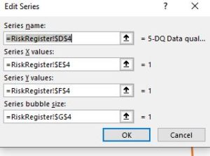
- Risk short name as Series name
- Probability as series Y values
- Impact as series X values
- Risk Score as Series bubble size
Note: In excel, the bubble chart does not display as expected by default. UPDATE: The solution referenced with the original blog post is no longer available; the following are the manual steps to create a multi-series bubble chart in MS Excel.
With the cursor in the graph, select the Design menu item. Choose Select Data Source and then Add. Add the correct cell references in the Edit Series dialog box for each risk you wish to display on the graph. If you wish to display 10 entries, you must do the steps 10 times (Figure 2).

Chart Background
Change the background of the chart plot area to use the color-coded risk matrix. (Format Plot Area, Fill, Picture or Texture Fill, Picture from File) (Figure 3)
Figure 3 Format Plot Area with Color-Coded Matrix
You can download a color-coded matrix to use as a background here. ==> Plot Background
Chart Axes
Change the horizontal and vertical axes so that the diagram displays as a matrix.
(Format Horizontal axis, Axis Options–Minimum 0, Maximum 5, Vertical axis crosses–Axis value 2.5)
(Format Vertical axis, Axis Options–Minimum 0, Maximum 5, Horizontal axis crosses–Axis value 2.5)
Bubble Labels
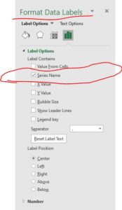
For each bubble, set the label options to the Series Name in the Format Data Labels dialog. (Figure 4)

Other risk related charts
Other visual charts for risk management include the burndown chart and radar.
Risk Burndown Chart is an area chart with the risk severity on the vertical axis (y-axis) and the time dimension on the horizontal axis (x-axis). The probability and impact for each risk short name are saved by iteration to track the evolution of the risks. The chart is useful for monitoring the trend of risk severity for individual risks or groups of risks. (Figure 5)
Figure 5 Risk Burndown Chart
Risk Radar is a radar chart for the severity of groups of risks. It is useful to visually idea the group of topics that have the most or least risks severity. (Figure 6)
Figure 6 Risk Radar
Engaging Team Members in Risk Management
Chapter 14 of “Going Agile Project Management Practices” describes practices that can be used to engage project team members in risk management. The book is available at amazon.


